

















In this article
You already decluttered. You moved the bed to the other wall, then moved it back. The room is tidier than it’s been in months and it still feels like a hallway with a mattress in it.
That’s because square footage and the perception of square footage are two separate problems, and you just spent a weekend solving the first one. This guide is about the second: how to make a small bedroom look bigger using color, natural light, reflection and sightlines, with every trick split into the version you can do today and the version that needs a landlord’s signature. Six levers, ordered by how much they change the room per hour of effort.
Quick Answer
A small bedroom reads bigger when the eye can travel further before something stops it. Six moves, each with a renter-safe version:
- Keep walls one light color, ceiling included. Skip the dark accent wall.
- Hang curtains high and wide, on a tension rod if you can’t drill.
- Place one large mirror where it reflects the window, not a wall.
- Add light at wall height. Plug-in sconces beat one ceiling bulb.
- Choose furniture you can see under and over.
- Leave a visible border of bare floor around the rug.
Why Your Small Bedroom Still Looks Small
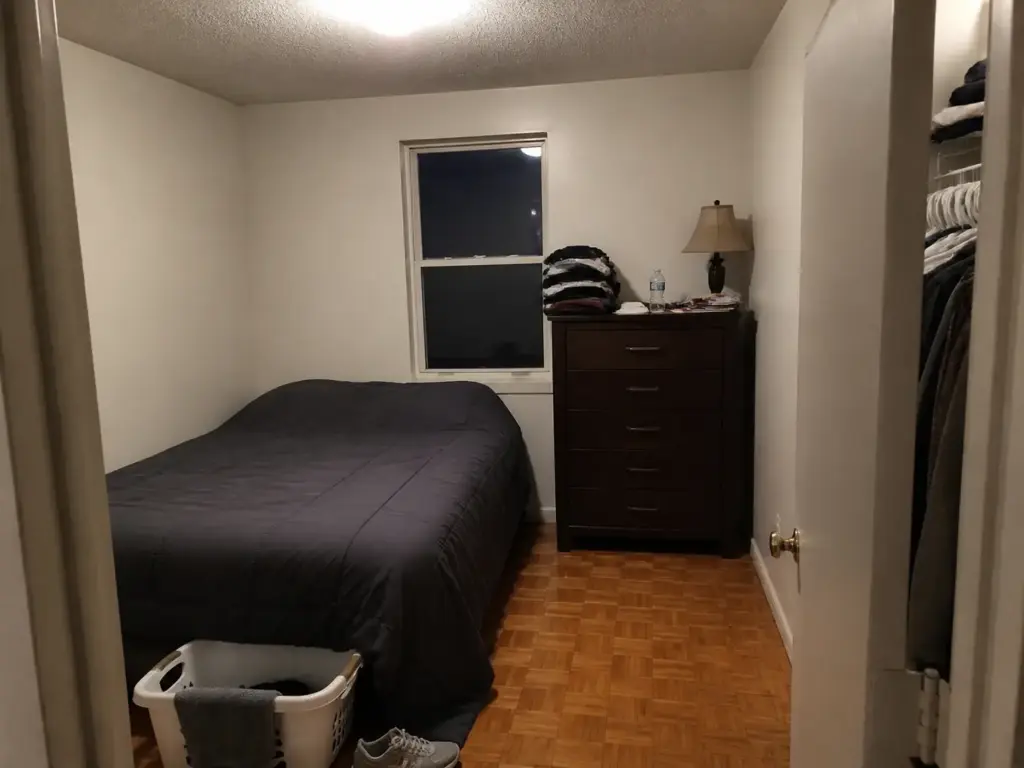
Here’s the reframe that makes everything below work: you solved storage, not perception. Those are different jobs. A room can be genuinely well organized, with nothing on the floor and every drawer closing, and still read as a shoebox, because perceived size has almost nothing to do with how much stuff is in the room and almost everything to do with how far your eye gets to travel before something interrupts it.
Think of it as three lines. The floor line, the wall line, the ceiling line. In a room that reads generous, all three run uninterrupted from where you’re standing to the far corner.
In a room that reads cramped, each one gets chopped: the floor line stops at a rug edge or a bed skirt, the wall line stops at a dresser, the ceiling line stops at a contrasting paint color or a rod hung right on top of the window trim. None of those interruptions removed a single square inch. They just shortened the trip. That’s the whole of visual space as a concept, and it’s why an optical illusion is a fair description of what the rest of this article does.
The second mechanism is light, and it’s the one most people never diagnose. One overhead bulb puts the same brightness on all four walls at once, which sounds like a good thing and isn’t.
Depth comes from variation. A corner that’s slightly dimmer than the wall in front of it recedes. Flatten that difference with a single ceiling fixture and every corner sits at the same visual distance, which is to say the room loses its back. This is why a bedroom can feel smaller at 9pm with the light on than it did at 4pm with the window doing the work.
Third: visual weight lives between roughly knee and eye height. That band is where dressers, headboards, hanging clothes and anything on top of a nightstand all sit. Fill that band across two or three walls and the room reads heavy no matter how clean the floor is. Above eye level and below knee level, you can get away with a lot more.
Community language is a good diagnostic here. People almost never describe a small bedroom as “small.” They describe it as cave-like or oppressive, and those aren’t size words.
They’re light words. A room somebody calls cave-like is a room where light stopped bouncing, which is a fixable problem and usually a cheap one.
Two things this article deliberately doesn’t cover, because they’re separate problems with separate answers. It isn’t about bed placement, furniture arrangement or clearance math, which is its own question with its own measurements, and if small bedroom layout is what’s actually bothering you, start with where the bed actually goes in a small room instead. It also isn’t a decluttering system. This is perception only: what the room does to your eye once the stuff is handled.
Before you change anything, stand in the doorway and take one photo on your phone. A photo flattens the room to a single plane, which is exactly how your eye is already reading it. You’ll spot the interruptions in the photo that you’ve stopped noticing in person, usually the dresser sitting at eye level and the curtain rod hung tight to the window trim.
Paint Strategy That Actually Opens the Room
The dark accent wall is the first thing almost everyone tries, and it’s the one people regret most. The pattern is depressingly consistent: someone paints one wall navy or charcoal because it looked incredible in a photo, and within a week the room reads smaller than it did in landlord white. Then it stays that way for the rest of the lease, because repainting is a whole Saturday.
Here’s the mechanism, and it isn’t complicated. In a bedroom with one window, your walls are functioning as a secondary light source. Light comes in, hits a pale surface, and bounces back into the room.
Swap one of those surfaces for a deep color and it stops bouncing anything. You didn’t add drama, you removed a light source, and in a room that only had one to begin with that’s a big percentage loss. This is why the failure is worse in a north-facing or ground-floor rental than it is in the sunlit room from the photo you saved. Light paint colors hand you reflected light; dark paint colors absorb it.
Worth being fair about this, because designers name deep accent walls as the small-room paint choice people regret most while also defending dark paint in general, and both things are true. The ones who defend it commit completely: all four walls, the trim, sometimes the ceiling.
Done that way the room loses its visible edges and reads as intimate rather than cramped, because there’s no bright wall left to measure the dark one against. That’s a real strategy. It’s also an advanced one that assumes you’re adding lamps to compensate and that you’re allowed to paint four walls. The half-measure is what fails: one dark feature wall, three light ones, no compensating light plan.
The default that works: a single wall color across every wall, and the same color or lighter on the ceiling. People skip the ceiling because it feels like a lot of work for a surface nobody looks at, but a ceiling in a contrasting shade draws a hard border around the top of the room and effectively announces where the height stops.
Carry the wall color up over that line and the border blurs. The room doesn’t get taller. It just stops advertising its limit. If you have crown molding or heavy baseboard trim, painting it the same value as the walls removes another pair of horizontal stop lines for the cost of an afternoon.
The upgrade on top of that is a monochromatic color scheme, sometimes called tonal layering: the same light color in slightly different values across the walls, bedding, curtains and rug. Warm white walls, oatmeal bedding, cream curtains. Nothing matches exactly and nothing contrasts hard, so there’s no single point where your eye snags and stops. Design writers describe the result as a room that reads as more generous than it really is, which is a fussy way of saying the walls stop having obvious edges.
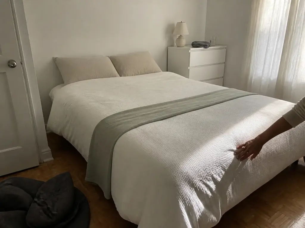
If you can’t paint at all, you can reproduce most of this in textiles, and that’s not a consolation prize. Landlord white is already the right value. What’s breaking the effect is almost certainly the dark comforter, the heavy curtains, and a rug two shades off from everything else.
Swap those three to the same light range and you get most of the tonal effect with zero deposit risk. Not all of it, I’d guess something like four fifths. But the bed is the largest single object in the room, and neutral bedding or plain white bedding is a bigger perceptual lever than changing one wall.
If you want the dark, moody bedroom badly enough to give up the size illusion, do it on the wall behind the headboard and nowhere else. It’s the one wall you never look at while you’re in the room, so you get the color in photos and from the doorway without staring at it from the bed. That’s the compromise version.
Mirror Placement: What It Reflects Is the Whole Trick
Everyone knows mirrors make a room look bigger. Almost nobody gets told the condition attached to it, which is that a mirror only multiplies light if there’s light in front of it. Point it at an interior wall and you’ve hung an expensive picture of drywall.
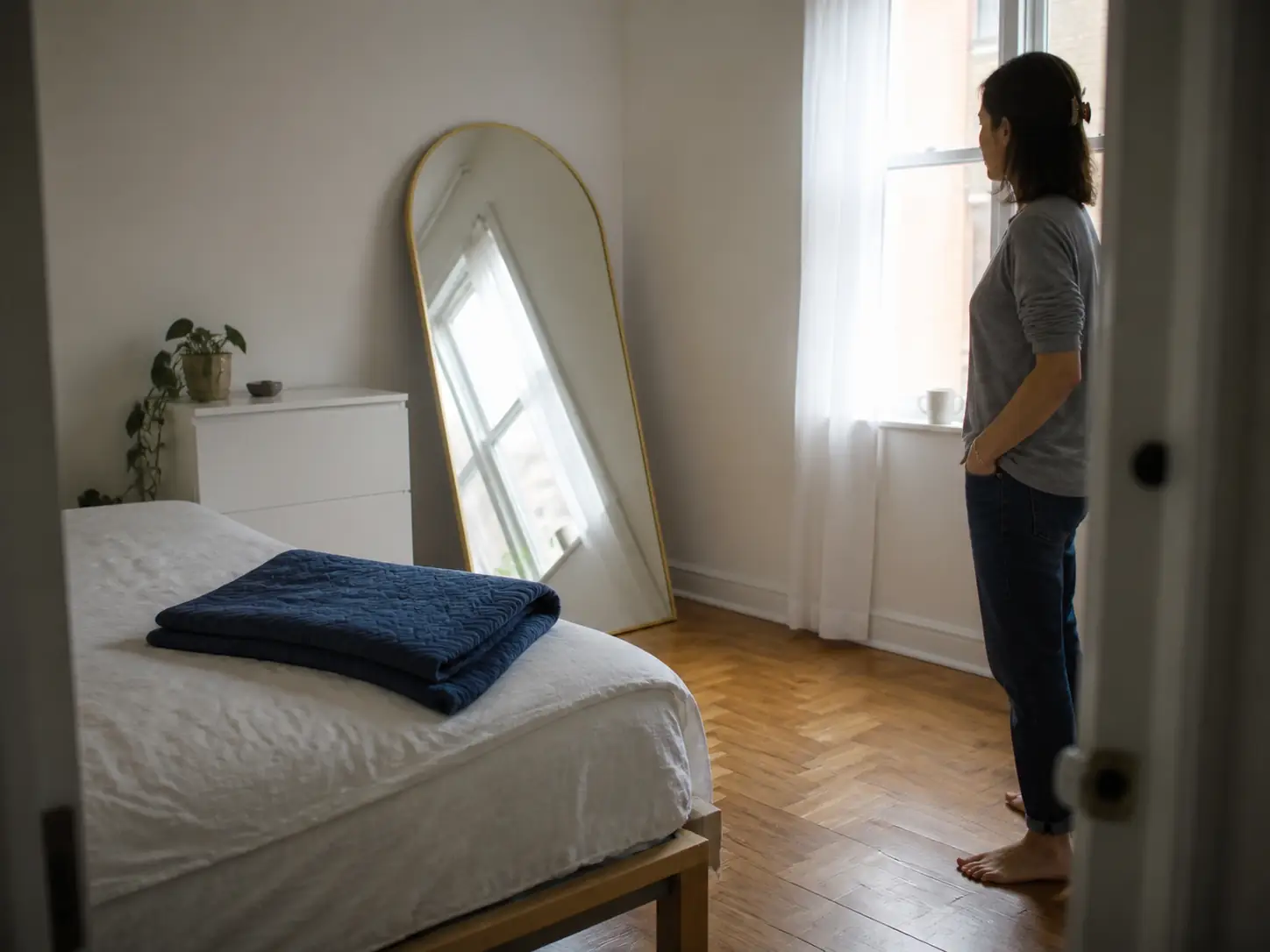
The rule in one line: a mirror opposite a window doubles your effective light source, and a mirror angled toward the doorway stretches the first sightline you get when you walk in. Those are the two positions worth having. Everything else is decoration.
There’s a test for this that costs nothing and takes ten seconds, and it comes straight out of how people describe getting it right on the second try. Stand in the bedroom doorway and look at the spot where the mirror is going. If from that position you’d see sky, window, or daylight on a wall, it’s placed correctly.
If you’d see the closet, an interior wall, or the top of your dresser, it’s doing nothing for the room. Worse, if what it catches is the dresser top, you’ve just doubled your clutter and taken a bright rectangle out of circulation. Hold something the size of the mirror up in the spot before you commit to anything permanent. A cardboard box lid works.
Size beats quantity, and this one’s counterintuitive because the gallery wall arrangement of five small mirrors photographs so well. Five small mirrors means five frames, and every frame is a hard edge landing in the eye-level weight band from the first section. One large mirror in the right position does more for perceived size than any cluster, and it does it with one edge instead of ten. The same logic applies to art: one piece of large-scale artwork beats a scatter of small frames.
If your closet already has wardrobe mirror doors, you own this trick for free and the only question is what they’re currently reflecting.
Now the renter constraint nobody in the search results seems to acknowledge: adhesive mounting has a hard weight ceiling, and it’s lower than you’d hope. Command’s own weight-rated hanging strips can hold mirrors up to 20 pounds without a single drilled hole, but that’s the dedicated Picture Hanging Strips line at the top of its rating.
General small and medium strips hold roughly 1 to 3 pounds per pair, which is a framed photo, not a mirror. Around 30 pounds is the practical cutoff where adhesive-only mounting stops being a reasonable idea at all. The same weight tiers govern adhesive hooks generally, so this is worth learning once.
Two rules come up over and over from people who’ve had one come down: check the actual listed weight of your mirror rather than guessing from its size, and spread the strips across the full width of the frame. A single pair in the middle is exactly how mirrors fall.
Which is why the leaning mirror is the renter default, honestly. The Dewfig Arched Full Length Mirror is 76 by 34 inches, big enough that one of them handles the whole job, and leaning it against the wall opposite the window needs no hardware, no strips and no weight math.
The trade-off is real and you should weigh it: a mirror that size takes up floor space, and floor space visibility is the thing this entire article is trying to protect. In a room under about 9 by 9 feet, giving up a foot of floor depth to gain a reflected window may not be the trade you want.
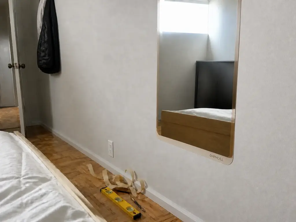
If it isn’t, the flat version does most of the work. A removable mirror in acrylic, like the OHPHCALL Self-Adhesive Acrylic Mirror, is peel and stick: it goes straight onto the wall or a closet door, takes zero floor space, and comes off without residue at move-out.
Acrylic isn’t glass, so the reflection is slightly softer and the panel needs a flat surface to sit properly against. On a textured wall it will show every bump. On a smooth closet door it’s the cleanest renter-friendly answer there is, and it’s the one that works in a shared room where a leaning mirror is a tripping issue.
Hang Curtains High and Wide
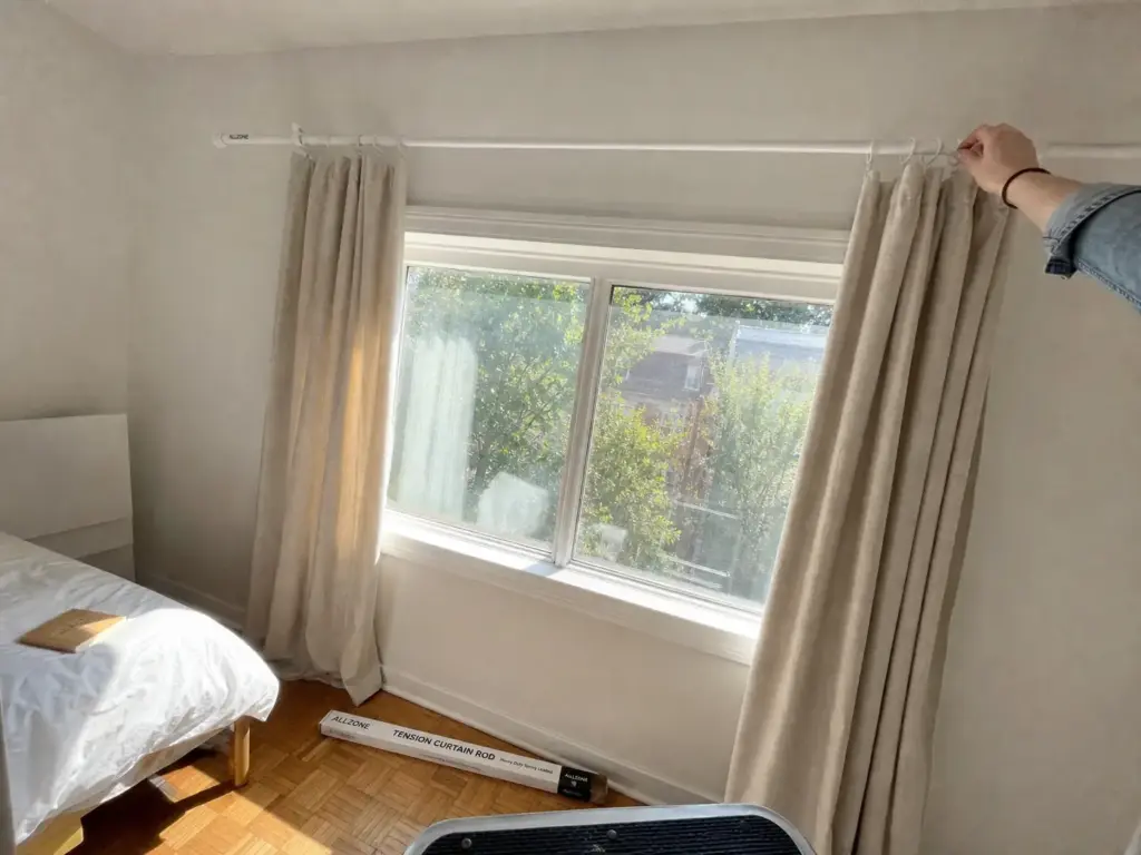
This is the highest-return change in the article and the cheapest, and it’s the one nearly everyone gets wrong in the same specific way: the rod goes up right on top of the window trim. Which is intuitive, and which announces the exact dimensions of your window to anyone standing in the doorway. You’ve framed the small thing instead of hiding it.
The numbers matter here, so here they are. Mount the rod 4 to 8 inches above the window frame, not on it. In a small bedroom you can push further, and a high-mounted curtain rod closer to the ceiling gives a stronger effect, with one condition attached: the panels have to reach the floor.
A rod near the ceiling with curtains that stop at the sill looks like a mistake, because it is one. The standard rod-height guidance from home-improvement pros lands in that same 4-to-8-inch range for normal rooms, and small rooms are where going higher pays off most.
Then go wide. Extend the rod 4 to 12 inches past the frame on each side. This is the half of the rule people skip, and it’s the half that gets you daylight. If the rod stops at the frame, your open curtains sit stacked on the glass and block a third of your only light source all day.
Extend it and the panels park on the wall instead, so the full span reads as window. You get more light and a wider apparent opening from the same window. Of every change you can make to window treatments, this one costs the least and shows the most.
Floor-length curtains, always. Panels that stop above the baseboard cut the vertical line partway down for the same reason a contrasting ceiling caps it at the top: any horizontal break tells the eye where to stop. Let them reach the floor, or hover a half inch above it if you don’t want them dragging. The unbroken drop is what creates the vertical lines doing the actual work here.
On fabric weight, I’ll be straight about the trade-off rather than pretending it doesn’t exist. Light, unlined panels are better for perceived size. Heavy blackout curtains read as visual mass hanging on the wall, especially in a dark color, and they eat the effect you just built.
But if you’re a light sleeper or your window faces a streetlight, sleep wins. That isn’t close. Get the blackout panels in the lightest color that still blocks light, hang them high and wide anyway, and accept that you’re trading some of the illusion for actual rest.
The no-drill path: a spring-loaded tension rod gets you the high-and-wide placement without a single hole. The ALLZONE Tension Curtain Rod adjusts from 83 to 123 inches, which covers most bedroom windows with room to extend well past the frame on both sides, and it holds by pressure against the walls on either side of the window rather than inside the casing.
Two caveats worth knowing before you buy. Pressure-mounted rods want a flat surface at each end to push against, so a window that sits tight into a corner gives you less to work with. And they hold lighter panels comfortably but sag under heavy blackout fabric over a long span. If you need both blackout and no-drill, use a shorter span and accept less extension.
That’s the whole section. Two measurements and a rod.
Layered Lighting Without an Electrician
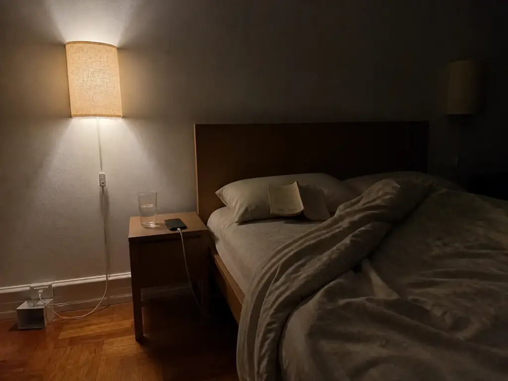
Layered lighting is the advice that sounds expensive, and it sounds expensive because every article that gives it illustrates the point with hardwired sconces flanking a headboard in a house somebody owns. The effect has nothing to do with what’s behind the wall. It comes from where the light sits.
Three layers, in plain terms. Ambient lighting fills the room. Task lighting covers what you’re doing, so reading in bed or getting dressed. Accent lighting puts light on a wall or into a corner for depth.
A single ceiling fixture is only the first one, and as covered up top, it’s the layer that actively flattens the room by lighting all four walls identically.
Wall lighting is what rebuilds the depth. Put a light source on a wall, at roughly the height of your shoulder when you’re sitting up in bed, and the wall it’s on gets brighter than the wall opposite it.
That difference in brightness is the entire depth cue. Your eye reads the dimmer surface as further away, which is exactly the mechanism the overhead bulb was destroying. A lit corner recedes. An evenly lit corner sits flat against your face.
I used to point people toward a pair of table lamps for this, since it’s the obvious no-installation answer. After enough threads where the lamp ends up crowding a nightstand that’s already holding a phone, a book, a glass of water and a charger, I switched to recommending wall-height light instead.
Getting the light off the surface is a two-for-one: you gain the depth cue and you clear the nightstand, and decluttered surfaces are themselves a perceived-size win because they empty part of that eye-level band.
Plug-in wall sconces need an outlet and nothing else. No junction box, no electrician, no conversation with a landlord. The Yunaking Plug in Wall Sconces come as a set of two with an on/off switch on the cord, which matters more than it sounds like it should, since a sconce you have to get out of bed to turn off is a sconce you’ll stop using by week two.
The limitation to plan for is the cord itself: it runs from the sconce down to the outlet and it’s visible. Some people run it behind the headboard, some use a few adhesive clips to trace it down the wall in a straight line. A straight visible cord reads as intentional. A drooping one reads as a mess.
That set of two maps onto something none of the competing guides address: shared bedrooms. If two people sleep in the room, one bright overhead is a negotiation every single night, because one of you is reading and the other is trying to sleep.
Two separate wall-height sources with their own switches means each person lights their own side without lighting the whole room. That’s not a decorating detail, it’s the reason the layered setup survives past the first week instead of getting abandoned for the ceiling light.
If you won’t attach anything to the wall at all, and plenty of leases and plenty of textured walls make that the right call, an arc floor lamp does the ambient and accent job freestanding. The SUNMORY Arc Floor Lamp has an adjustable arc that reaches over the bed, so it covers reading light too, and three color temperatures let you run it warm at night and cooler during the day.
The trade-off is the same one as the leaning mirror: it needs a base-sized patch of floor, and floor is the currency this whole article is spending. In a genuinely tiny room, the plug-in sconces are the better use of the space.
Aim one light source at a wall or a corner rather than into the middle of the room. Light hitting a wall spreads across it and gives you a large soft bright surface, which is the closest you’ll get to faking a second window. Light aimed at the room’s center just illuminates the air and puts everything on the same flat plane again.
Keep the Floor Visible
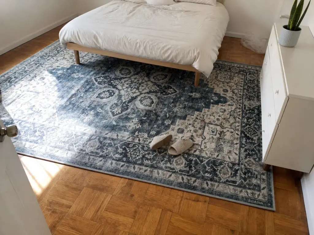
The amount of floor you can see is the single strongest cue for how big a room reads. Not the square footage, not the ceiling height. The visible floor. It’s also the easiest thing on this list to wreck, and the two usual culprits are a rug bought for a different room and furniture that meets the floor in a solid block.
Start with the furniture, because it’s free to reason about. Furniture with legs shows you the floor underneath it, which your eye reads as more room even though nothing moved. A bed with a skirt to the floor, or a solid dresser with no gap at the bottom, reads as a wall segment. Same footprint, completely different result.
Raised furniture of any kind, a floating nightstand, a dresser you can see under: all of them add visible floor without removing a single object. Swapping a bulky base for a low-profile box spring does the same job from the other direction. And a raised bed frame gives you usable space you can also see into, which is its own decision, so if you’re about to fill it, look at under-bed storage that doesn’t block the sightline first. Opaque bins pushed to the edges preserve the effect. A wall of exposed boxes cancels it.
There’s a height ceiling too, and it’s a number no competing guide gives you. In a small bedroom, keep furniture under roughly 40 to 48 inches tall, with one exception: a single floor-to-ceiling shelving wall is fine and often good, because a deliberate full-height piece reads as architecture rather than as clutter.
Everything else stays low. The reason is open wall. When your furniture line sits below eye level, you see continuous wall above all of it, and continuous anything is what makes a room feel bigger than the tape measure says. A room ringed with 60-inch furniture has no visible wall left at the height you actually look.
This is also the argument for wall-mounted shelves or floating shelves over a second dresser: they claim vertical space you weren’t using and leave the floor alone. A tall wardrobe is the one piece worth breaking the rule for, and only against a single wall.
Two smaller moves in the same family, since they come up constantly. A tall headboard works the way high curtains do, drawing the eye up a wall you’d otherwise read as ending at mattress height, and it costs no floor at all. And houseplants belong up, not down: a trailing pothos on a shelf or a snake plant on top of the dresser adds a vertical line and some life, while the same plants in floor pots are just objects eating the floor you’re trying to keep visible.
Now the rug, which people get wrong twice. The standard rule is an 8×10 under a queen bed, positioned so it extends roughly 18 to 24 inches past the sides and the foot, with the standard rug-sizing rule of thumb reserving 12 to 18 inches of visible floor between rug edge and wall.
That bare border is the whole point. It’s what makes the floor read as one continuous surface with a rug on it, instead of as a floor interrupted. If you have wood flooring or laminate flooring running in one direction, that border also keeps the plank lines visible, and those lines are free vertical-to-horizontal depth you already paid for.
Mistake one is going too small. A 5×7 under a queen bed floats like an island in the middle of the room and chops the floor into three unrelated pieces: rug, floor, wall. Visually that’s worse than no rug at all, and it’s the most common version of this error because smaller rugs cost less and it feels like the safe choice.
Mistake two is applying the 8×10 rule to a room it wasn’t written for. That standard assumes roughly a 10×10 room or larger. In a room under about 9 by 9 feet, an oversized rug covers nearly the entire floor and erases the exact cue you were protecting.
There, a runner along the walking side of the bed, or bare floor with a small rug where your feet land, beats forcing the standard. Size the rug to the room, never to the bed.
If your room is in the range where the standard applies, the AMADA HOMEFURNISHING 8×10 Washable Area Rug matches that sizing with a low-profile backing, which solves a small-room problem thicker rugs create: a plush rug near a bedroom door can catch the door’s swing, and in a tight room that’s a daily annoyance rather than an occasional one.
Non-slip backing, machine washable. The honest caveat is that low-profile means low-profile, so if you wanted something you sink into on a cold morning, this isn’t that rug.
Then there’s the part that decides whether any of this survives. The floor is where the effect erodes first, and it erodes within weeks. Not dramatically.
A laundry basket that lands in the corner and stays. A tote bag by the door. Two pairs of shoes that become five.
Each one is individually reasonable and collectively they eat the visible border you just built, which means the room quietly reverts to reading small while every other change is still technically in place. The floor has to be the surface nothing lands on, and holding that line is a maintenance habit rather than a decorating decision, so if surfaces are where your systems usually break down, that’s what the surface-clearing system that keeps it that way is built for.
Conclusion
Three things to hold onto. Light either travels or it stops: keep the walls, ceiling and textiles in one light range, and put a mirror where it catches the window rather than the closet.
Every trick here has a no-drill version: tension rods, plug-in sconces, adhesive acrylic panels, a leaning frame. Most of them are budget-friendly enough that the whole list is an afternoon and a couple of orders rather than a splurge. Renting costs you permission, not results, and the one trick you genuinely can’t do without permission is the accent wall, which is also the one most likely to backfire in a small room anyway.
The floor is the scoreboard: visible floor, furniture you can see under, and a rug sized to the room instead of to a catalog photo.
In three months, look at the floor first. If the bare border around the rug has been eaten by a laundry basket and a pile of shoes, nothing else on this list is still working, and no amount of paint or mirrors will compensate for it.
Start with the curtains. It’s the cheapest change here, it takes an afternoon and one rod, and it’s the one you’ll notice from the doorway the moment you walk in.
Frequently Asked Questions
01What is the best color to make a small room look bigger?
Light, low-contrast colors reflect the most light and blur the line where wall meets ceiling: soft white, off-white, pale greige, light sage. The exact shade matters less than the contrast between surfaces. One light color carried across the walls and the ceiling beats a perfect paint pick used on a single wall.
02What color bedding makes a room look bigger?
Bedding in the same value range as your walls, because the bed is the largest visual object in the room. A white or light neutral duvet against light walls lets the eye pass over the bed instead of stopping at it, which is exactly what a dark comforter in a pale room does.
03How to give the illusion of a bigger room?
Extend the sightlines in all three directions. Up, with curtains mounted near the ceiling and light ceiling paint. Out, with a mirror facing the window. Across, with furniture on visible legs and a correctly sized rug. Each one lets the eye travel further before something stops it.
04How do you make a small bedroom look bigger when you rent?
Every high-impact trick has a no-drill version: a tension curtain rod hung high and wide, a peel-and-stick acrylic mirror or a leaning frame, plug-in sconces instead of hardwired ones, and light textiles standing in for paint you can’t apply. The only thing renting really costs you is the accent wall, which backfires in small rooms anyway.
05Is a rug a good idea in a very small bedroom?
Only if it’s sized to the room rather than to the bed. The standard 8×10-under-a-queen rule assumes a 10×10 room or larger with 12 to 18 inches of floor showing around the edges. In a room under about 9×9 that rug covers nearly everything and erases the floor cue you’re protecting. A runner along the walking side works better there.